Wednesday 31 July 2013

Blending - Stourhead

This is not the most eye catching of the three layouts I created with the lovely kit, Smitten, by Algera Designs (available from E-Scape and Scrap), but it is my favourite from a blending perspective.  I love the effect of the blending of the two photographs. The flower and butterfly elements complemented the layouts perfectly to finish off the layout.

Stourhead Garden through open doors / Photos © 2013 Natasha Forder
In Craft Artist:

  • On layer 1 I enlarged a photo of trees until it fitted the page and cropped the excess.
  • For the background selected a dark paper with a faint pattern.
  • Selected the photo and applied the soft light blend mode.
  • On layer 2 I enlarged the photo looking out of the doors until the doors just fitted on the page.
  • Selected the photo and applied the lighten blend mode.
  • The frame above the doors was distracting and using the scissor tool removed it, because of the blend on the photo it was easy to cut out as not all of it was visible.
  • On layer 3 I added the elements and recoloured the butterflies.
  • The text used is Edwardian Script ITC.
For Inside Stouhead I used a gold coloured lightly patterend paper for the background, enlarged the photo to fit the width of the page and applied the hard light blend mode to create a warm and bright effect.  Finishing off the page with a few elements, to add interest and hide the hard edge of the photo.  The font is Piranesi It BT.

Stourhead Garden is a more traditional page using frames for the photos, to which I had applied a sepia effect.  The font is Edwardian Script ITC.  No blending here!

The photos are my own.

yourimagetitle
Inside Stourhead
yourimagetitle
Stourhead Garden
Inside Stourhead was selected as a reals standout on Real Life Scrapped: Real Standouts August 1st :)

Friday 26 July 2013

Blending - Yarmouth, Isle of Wight

I love the effect of photos blended into papers and there are several papers in the kit I've used for the layout below for that are perfect for this.  The kit is Sea Breeze by Wisteria Moments which can be purchased from E-Scape and Scrap, and not only has lots of lovely papers but lots of great coordinating elements too.

Yarmouth, Isle of Wight / Photo © 2013 Natasha Forder
I use Craft Artist by Serif for creating my scrapbook layouts.  I love it as it is easy to use and doesn't take long to get the hang of!  I create all my pages 12"x12" size and scale down to 8"x8" if I want to print.

For this layout:
  • On layer 1, I enlarged the photo so it fitted top to bottom of the page and aligned it to the left.
  • Selected a pale but textured paper for the background layer underneath.
  • Selected the photo and applied the colour burn blend mode.
  • On layer 2, created a border along the right edge of the photo to hide up the hard line and create interest.
  • Added in the postcard as this was the perfect way to detail the location of the photo, the font used is Annie BTN.  
I created the following two layouts in a similar way, from the same kit, using the colour burn blend mode as for the layout above.

The photos are my own, which I took during a trip to the Isle of Wight, a few years ago.

yourimagetitle
The Needles, Isle of Wight
yourimagetitle
Yarmouth Pier, Isle of Wight

Sunday 14 July 2013

Natures Beauty


Natures Beauty © 2013 Natasha Forder
As much as I love to use kits designed by all those great designers out there, from time to time I like to have a go at creating my own papers, elements and alphas.  I create them from my own photos and sometimes my partner's, Steve's, as well as a few drawings I have done.  I use the tools that are available in Craft Artist too, for things like creating textures on papers and adding effects.

I've created this page from the largest kit of coordinating items that I've created and was really pleased with the outcome :)

Saturday 13 July 2013

Hello :)

forget-me-not craft has been a project in progress for quite a long time and delayed by all sorts of distractions from actually crafting to not quite finishing the design for my banner and background!

But it is finally here!

I created both with elements and papers created from photographs I'd taken, the squirrel from a drawing and the little circle element created in craft artist.

The blue tit I cut out from a photo and converted it to a drawing.
The duck is from a photo, I cut the duck out, turned it to a silhouette and then changed it to pale blue.
The forget-me-not flowers were cut out from the photo used as the backing for the header.

I am teaching myself how to draw and the squirrel was copied from How to Draw Anything by Mark Linley. I then scanned it in and cut it out.  This is my favourite drawing I've done so far!

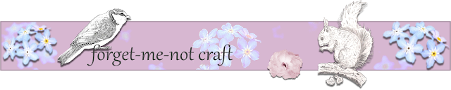
forget-me-not craft banner © 2013 Natasha Forder

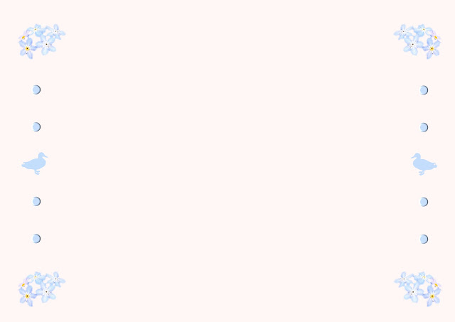
forget-me-not craft background © 2013 Natasha Forder